Wednesday, May 11, 2011
Ok, so this is my last self chosen project for the class. After this I will be starting a papermation. But for this project I took a project I did previously in the class. I took each layer (there were 5) and separately put each layer across 3 frames the same size as printer paper like the vines are above. After I print each layer I put the paper for each layer together so that they as 3 pieces of paper made the correct image for the layer. I taped each layer to a thin piece of cardboard and began cutting. The stencils are above. Then it was time to spray paint. This surprisingly was the hardest part in order for them to look good. I had to use a stick to hold the stencil down in order to get smooth lines. Put after all the work I'm happy with the results. It looks a lot better than most spray painted shirts I've seen around campus. If I were to make another this way, I might look to do less detail. Thats what got me during the hard times.
Monday, May 9, 2011
Tuesday, April 26, 2011
 |
Wednesday, April 6, 2011
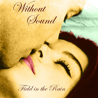
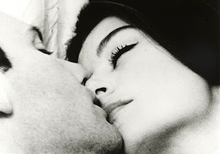
This is my first of five projects for the final quarter. I set out to add color realistical to a black and white picture. I found this old picture from the 1930's from a French movie. From there I used to original picture and added Solid Color under the layer, that thingy thats like a circle. Half the circle is black and the other white. So once that is engadged you choose a color, say the skin, and just pit a random orange. The adjusting comes later. This created a mask over the picture if you set the mask to Color. Erase everything that doesnt need that color. I repeated that step over and over for every color. From there I did some editing. Rotated the picture, added text, and ofcourse adjusted the color. I did so by double clicking the color in the layer and manual moved the little circle to the correct shade of the color selected. I'm very happy with the results but must admit it doesnt look very realistic. Like its obvious that it wasnt originally a color picture and wouldnt do well on a Pleasantville challange on worth 1000 but I think the way it turned out is fitting for its intended purpose. I those this project to learn how the worth 1000 people added the color. They have a different more time consuming way, but they also get much better results.
 |
| Final Product |
 |
| Original Picture |
Monday, March 28, 2011
 |
| My theme for the theme projects is the Kennedy Family. |
1. Describe your overall thoughts on the final piece.
I'm happy with how they all turned out. They are all very different.
2. How successful do you feel this piece is and why?
I think they were successful because they are all different but still hold the theme constant.
3. What worked about this project? What didn’t work?
I didn't understand what we were doing with the themes at first so the theme I chose was a little difficult.
4. If you were to do this project over again, what changes would you consider making?
I would say I would pick a different theme to make it easier, but I think picking the harder theme worked in my advantage. 5. What was the most difficult part about completing this piece and why?
The silver spoon dollar took a long time to edit out all the normal one dollar parts.
6. What did you learn from this piece?
I learned a lot about masking and planning a piece out.
Tuesday, March 22, 2011
Monday, March 7, 2011
 |
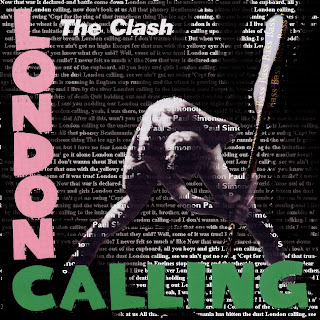
| London Calling |
Monday, February 28, 2011
Sunday, February 27, 2011
Wednesday, February 23, 2011
This is my entry for Doodle 4 Google. The theme was "One day I would like to..." so I chose "...design a comic book". I'm happy with how it turned out. I stayed very close to origional comic drawings. I had a difficult time finding what worked in the spots of the letters. The detail was the most difficult part.
Thursday, February 3, 2011
Subscribe to:
Posts (Atom)


