Monday, March 28, 2011

Yeah, it's on a shirt.

I have to answer the 6 questions. So basically I like the shirt the most. I used dodge and burn to get the wrinkles. I dislike the cup. wrapping that sucker was annoying. Yay, the theme things done. I hope this covers the 6 questions.
It's on a box

And don't you think I can't put this junk on cups too.


My theme for the theme projects is the Kennedy Family.

1. Describe your overall thoughts on the final piece.
I'm happy with how they all turned out. They are all very different.
2. How successful do you feel this piece is and why?

I think they were successful because they are all different but still hold the theme constant.
3. What worked about this project? What didn’t work?

I didn't understand what we were doing with the themes at first so the theme I chose was a little difficult.
4. If you were to do this project over again, what changes would you consider making?

I would say I would pick a different theme to make it easier, but I think picking the harder theme worked in my advantage. 5. What was the most difficult part about completing this piece and why?
The silver spoon dollar took a long time to edit out all the normal one dollar parts.
6. What did you learn from this piece?

I learned a lot about masking and planning a piece out.

Tuesday, March 22, 2011

Newimal
 This is my newimal. it is half play and half organ.. it so happens the vines spell something... crazy. anyway its a newimal that i made scratch.

Tuesday, March 15, 2011

Monday, March 7, 2011

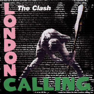
London Calling
This piece is made of text, but unfortunately i feel like i had to relie on the outline/gray shading for Paul Simonon and that this name didnt do the job. Im happy the backround text could created the correct backround of the origional picture and that I could use the origional colored texted. The backround text is the lyrics of the song. Thought that was clever. If i did this project again i would work to make the person more out of text.

Tuesday, March 1, 2011